
403 Forbidden
ERR_WEB_NGX_403
Your bedroom should be your own personal sanctuary. A space where you can unwind and recharge after a long day. And one of the most effective ways to create that perfect retreat? Feature wall colours that speak to your personality and help you sleep better too.
Whether you're dealing with a compact bedroom that needs a splash of character, or a larger space crying out for some depth and drama, the right accent wall can completely change how your room feels. It's not just about looking good – though that's certainly part of it.
The colours you choose for your bedroom feature wall can actually make a real difference to how well you sleep. Take blue tones, for instance. They can genuinely lower your heart rate and help reduce stress levels, making them brilliant choices for restful nights. Meanwhile, warm colours like soft yellows and gentle oranges bring a sense of joy and comfort, creating a lovely atmosphere to wake up to each morning.
From sleek navy and crisp white combinations to calming earthy shades that promote peace, the best bedroom colours really depend on your personal style and the mood you want to create. You'll discover how to use tried-and-tested design principles like the 60-30-10 rule for a perfectly balanced look. Whether you're drawn to soft pinks that create feelings of warmth or refreshing dark greens that bring harmony, you'll learn how to select accent wall colours that truly reflect who you are.
Ready to create a bedroom feature wall worth talking about? Let's dive in.
Colour selection goes far beyond simply picking shades that look pretty together. The psychology behind different hues can genuinely influence how well you sleep and how you feel when you wake up.
How colours affect sleep and mood
The colours surrounding you each night have a remarkable ability to influence your body's responses. With 40% of adults experiencing sleep issues at some point, choosing the right bedroom feature wall colours becomes more important than you might think.
Blues and greens work particularly well for bedroom accent walls because they can physically lower your heart rate, reduce blood pressure, and decrease anxiety levels. These cool tones create a mental connection with the sky and sea, naturally encouraging feelings of calm and serenity.
Vibrant reds and oranges, however, might do the opposite of what you want in a bedroom. Studies suggest they can actually raise pulse rates and even increase feelings of aggression. Not exactly the vibe you're after when you're trying to create a restful retreat.
Warm colours—think yellows, oranges, and gentle reds—bring energy and positivity into your space. These shades create cosy, intimate environments that can make larger bedrooms feel more welcoming and comfortable.
Cool colours—blues, greens, and purples—contribute to a sleek yet soothing atmosphere. They're particularly brilliant for bedroom wall colours because they help smaller spaces feel more open whilst promoting relaxation.
Many designers swear by balancing both warm and cool elements. As one expert explains, "Mixing warm and cool colours together via accent hues" creates a more three-dimensional, elevated look. This approach works beautifully when you're selecting bedroom feature wall colours.
Colour acts as a powerful tool that influences not just your mood but also your physical reactions. The impact can be surprisingly significant—one colour expert warns that "the right or wrong shade of red in a bedroom can either encourage romance or divorce proceedings".
Your room's characteristics should guide your colour decisions. North-facing bedrooms receive cooler, greyer light throughout the day, whilst south-facing rooms enjoy warm, golden afternoon sunlight. You might need warmer tones in north-facing rooms to balance out that cooler natural light.
Don't forget how colours affect how spacious your room feels. Bright, warm tones make objects appear closer and larger, whilst darker shades make rooms feel more enclosed. This principle becomes essential when you're choosing accent wall colours to create exactly the atmosphere you want.
Choosing the perfect colour combinations for your bedroom feature wall really comes down to your personal style. Each design aesthetic has its own signature palette that creates a distinct look and feel.
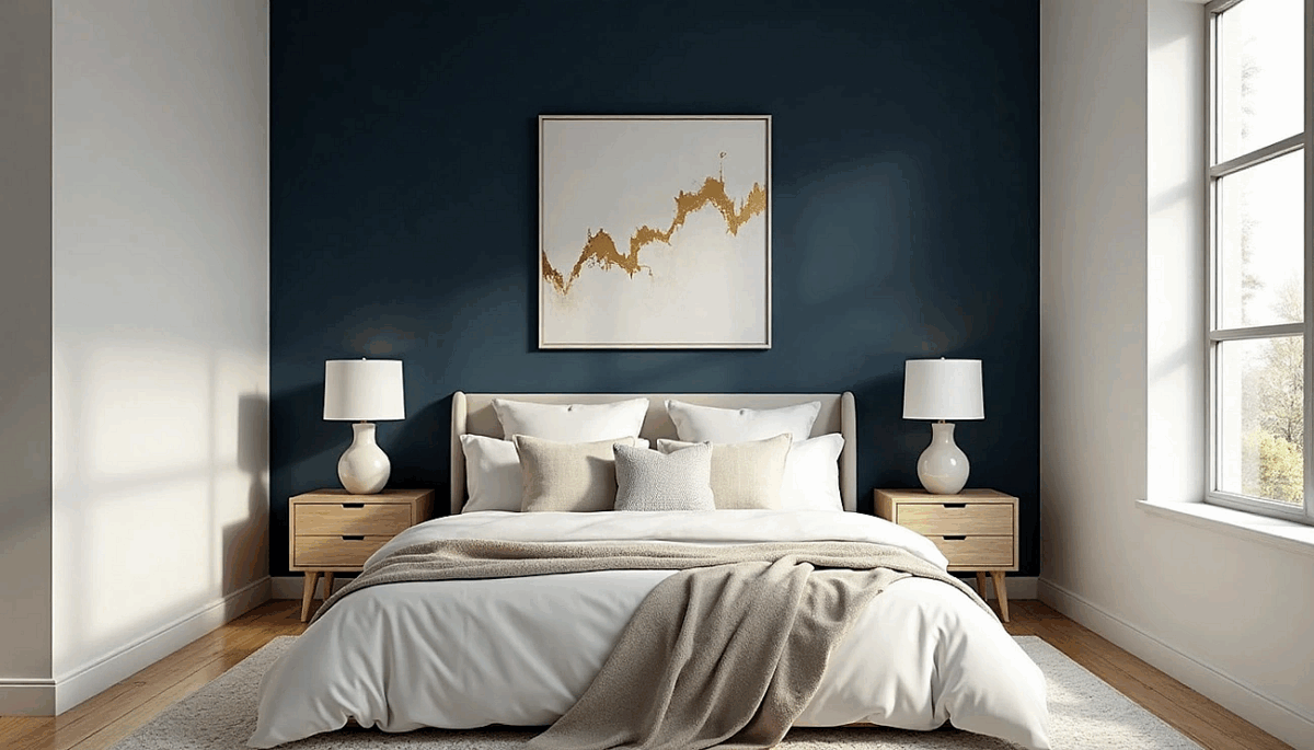
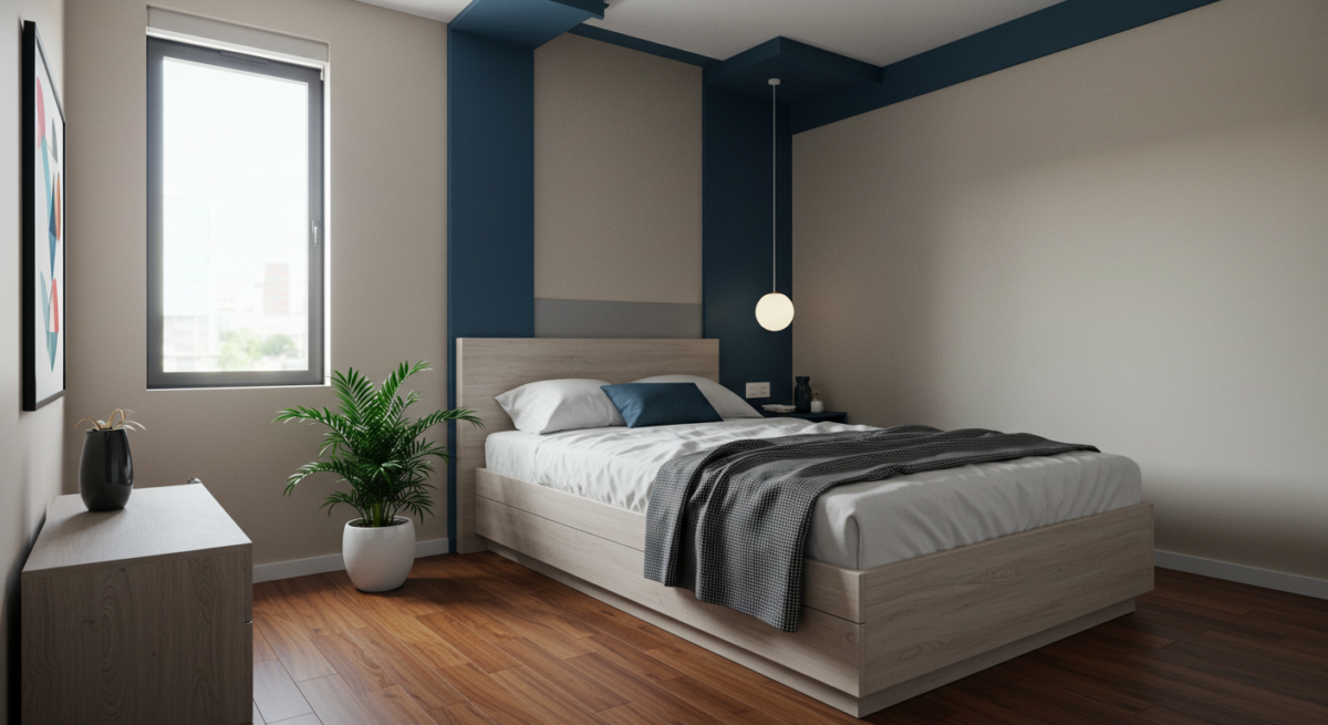
Modern: Navy and white
Navy blue feature walls paired with crisp white deliver drama and sophistication in equal measure. This classic combination works beautifully when you want to make a bold statement without going overboard.
Deep navy grasscloth wallpaper creates a striking backdrop that makes upholstered headboards really pop as the room's focal point. For larger bedrooms, try adding brushed gold mirrors or cabinets against your navy feature wall – the contrast creates an instant luxury feel.
Takeaway Tip: Navy is incredibly versatile and complements most interior schemes, though it will make your space feel more intimate.
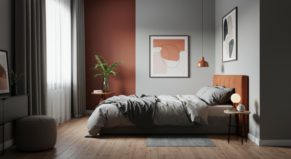
Rustic: Terracotta and cream

Terracotta brings the warm beauty of sunbaked clay straight into your bedroom, instantly adding natural warmth to any space. Paired with cream, this rich reddish-brown creates the perfect rustic retreat.
What makes terracotta brilliant is that it's much more versatile than bright red – you can create anything from a cosy country sanctuary to a Mediterranean-inspired escape. Balance it with neutrals like cream or ivory for that authentic rustic feel, or pair it with woodland greens for an earthy, grounded atmosphere.
Minimalist: Grey and sage

Grey provides the perfect neutral foundation for minimalist bedrooms, working beautifully across cool and warm tones while maintaining that calm, uncluttered feel. Pair it with sage green and you've got a fresh, soothing combination that's perfect for restful sleep.
Sage brings all the calming qualities of green whilst adding subtle visual interest without overwhelming your space. This pairing works particularly well if you've got plenty of natural light or large windows – it gives you the perfect backdrop for incorporating natural materials and textures.
Boho: Mustard and teal
Boho style is all about expressing your personality through rich, vibrant colours. Teal combines the calming qualities of blue with the energising properties of green, creating a fantastic foundation for your bedroom.

Mustard yellow brings out teal's underlying vibrancy, creating an eye-catching combination that's both playful and sophisticated. The contrast between cool teal and warm mustard adds real intensity and excitement to your space. Complete the look with natural fabrics, mixing patterns, and textural elements like wood, wicker, and bamboo accessories.
Classic: Blue and beige
Blue and beige create a serene, sophisticated palette that turns your bedroom into a proper tranquil retreat. This timeless combination works particularly well in traditional settings – think deep Breton Blue bringing immediate sophistication to your space.
Try using a deep navy blue feature wall with complementary beige tones for a chic contrast. This pairing gives you loads of styling options – from nautical-inspired designs with cream soft furnishings to more luxurious schemes featuring gold accessories and pendant lighting.
Your bedroom's size and the amount of natural light it receives will guide you towards the perfect feature wall colour. Get this right, and you'll create a space that feels just how you want it to.
Light colours have an almost magical ability to make smaller bedrooms feel more spacious. Pale shades reflect more light around the room, making walls appear to recede and creating that all-important sense of openness.
Soft blues and greens work particularly well for compact bedroom feature walls. Not only do they help your room feel larger, but they also bring that calming atmosphere you're after. Think gentle shades like Duck Egg Blue or Willow Tree – colours that breathe life into your space without overwhelming it.
Don't worry though – having a smaller bedroom doesn't mean you need to play it safe with boring colours. You can still create an eye-catching accent wall with colours like Tropical Splash, a gorgeous turquoise that brings calm energy when used thoughtfully. Even darker shades like Wing Commander, a sophisticated grey, can work brilliantly as an anchor colour in cosier spaces.
Generous bedroom spaces are perfect for richer, deeper feature wall colours. Dark paint adds real personality to spacious bedrooms, creating that cosy feeling through colour-drenching techniques. The beauty of larger rooms is they can handle bold colour statements without feeling cramped.
Darker colours like deep navy, forest green or rich plum create a stunning focal point whilst adding intimacy to otherwise vast spaces. These deeper tones help balance your room's proportions by visually bringing walls closer. For a luxury hotel feel, darker shades create that enveloping, cocoon-like atmosphere that's perfect for restful sleep.

The direction your bedroom faces makes a real difference to how colours appear throughout the day. North-facing rooms receive cooler, greyer light, which can make colours appear more muted. South-facing rooms enjoy strong, clear natural light all day long, giving them a warmer glow.
For north-facing bedrooms, choose warmer neutrals with yellow, beige or red undertones to counteract that cooler light. Alternatively, embrace the moodier northern light by selecting deep, enveloping shades like rich greens or plums that create a beautifully cosy effect.
South-facing rooms give you more flexibility with colour choices thanks to all that lovely natural light. Cool shades such as blue, green, and violet help balance the intensity of sunlight, preventing your room from feeling too warm or bright. Off-whites with crisp blue undertones work exceptionally well in these light-flooded spaces.

Takeaway Tip: Test your chosen colours at different times of day to see how the changing light affects them.
Creating a show-stopping feature wall goes beyond simply picking a colour you like. These tried-and-tested tips will help you achieve professional results that turn your bedroom into the perfect retreat.
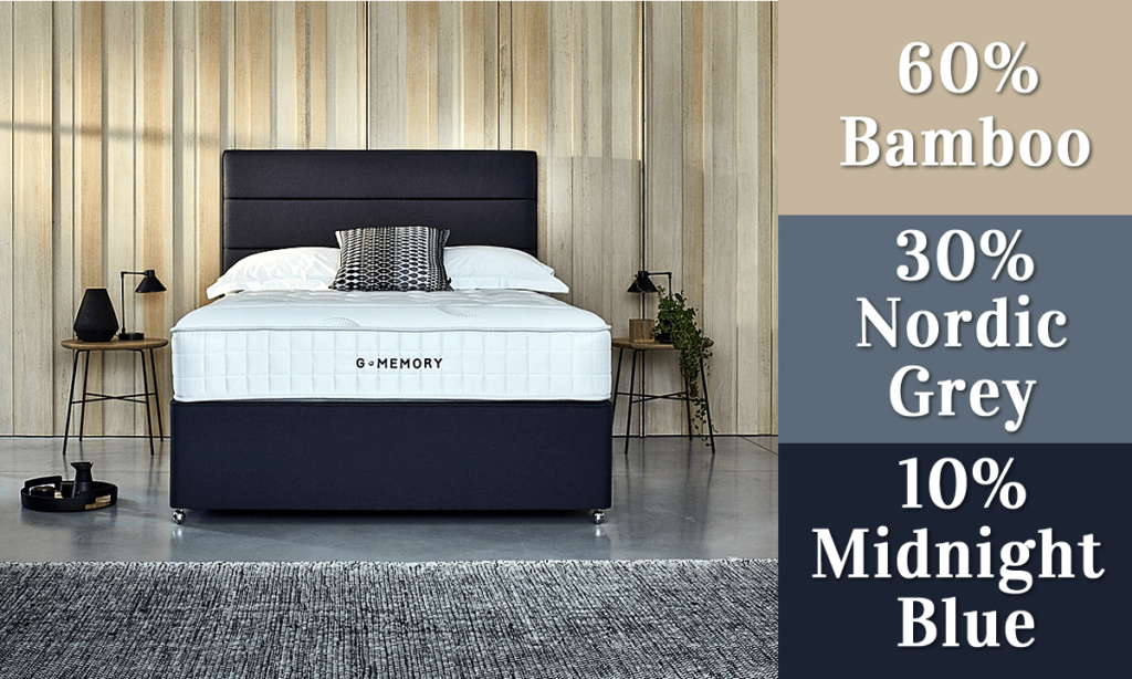
The 60-30-10 colour rule gives you a foolproof way to create a harmonious bedroom design. This designer-approved approach ensures no single colour takes over your space while keeping things visually interesting:
Your bedroom accent wall typically fits into that 30% portion, creating just the right amount of visual impact without overwhelming the space.
Light can completely change how paint looks throughout the day. Rather than painting straight onto your walls, create large samples on poster board that you can move around the room. This way, you can see how colours shift from morning light to evening without any messy do-overs later.
Make sure you love your colour choice both in natural daylight and when your artificial lights are on in the evening. Don't forget to apply two coats on your test samples – this gives you the most accurate picture of the final result.
Your feature wall should feel like it belongs with everything else in the room. Look for colours that share similar undertones with your existing furniture and decor to create that intentional, pulled-together look.
Feature walls are brilliant for showing off your personality, but restraint is key. Stick to bold patterns or vibrant colours on just one wall to avoid visual chaos. You can also consider adding texture instead of intense colour – think materials like wood panelling or textured wallpaper that add interest without dominating the space.
Remember, the best feature walls enhance your bedroom's natural character whilst helping create that restful retreat you're after.

You've got all the tools you need to create a bedroom feature wall that's worth talking about. The colours you choose really do make a difference – not just to how your room looks, but to how well you sleep and how you feel when you wake up each morning.
Whether you're drawn to the calming properties of soft blues and greens, the warmth of terracotta and cream, or the drama of deep navy paired with crisp white, remember that your bedroom should reflect your personality. After all, this is your personal retreat from the outside world.
Don't forget to consider your room's size and natural light when making your final decision. Light colours work wonders in smaller spaces, while darker tones add depth and cosiness to larger bedrooms.
The 60-30-10 rule will keep your colour scheme balanced, and testing your chosen shades in different lighting conditions will save you from any unwelcome surprises. Most importantly, trust your instincts – you know what makes you feel relaxed and happy.

Ready to get started? Whether you're planning a full Weekend Project or just want to dip your toe in with some testers, your perfect bedroom feature wall is waiting to be created. Sweet dreams ahead!
Q1. How do colours affect sleep and mood in a bedroom? Colours can significantly impact sleep quality and emotional state. Blue and green tones can lower heart rate and reduce anxiety, promoting better sleep. Warm colours like yellows and oranges can create a cosy, uplifting atmosphere.
Q2. What colour combinations work well for a modern bedroom feature wall? A popular modern combination is navy blue and white. This pairing creates a dramatic yet sophisticated backdrop, especially effective when using navy as the feature wall colour with crisp white accents.
Q3. How can I choose the right feature wall colour for a small bedroom? For small bedrooms, light tones are ideal to create an illusion of more space. Soft blues and greens can make the room feel larger while promoting tranquilly. Even in compact spaces, you can use bolder colours like turquoise in moderation for visual interest.
Q4. What is the 60-30-10 rule in bedroom colour design? The 60-30-10 rule is a designer principle for achieving balance in room colours. It suggests using 60% of a dominant colour (walls, flooring), 30% of a secondary colour (furniture, curtains), and 10% of an accent colour (accessories). The feature wall often falls into the 30% category.
Q5. How should I test feature wall colours before committing? Create large samples on poster board that you can move around the room. This allows you to see how colours appear in different lighting conditions throughout the day. Apply two coats to accurately represent the final result, and ensure you like the colour in both natural and artificial light.